The orange color palette evokes warmth, energy, and creativity. It is vibrant and impactful, making a bold statement.
The various shades of orange can range from bright and energetic to soft and soothing, offering versatility in design. Whether used as an accent color or as the main focus, orange can add a pop of color to any space.
In branding, orange is often associated with enthusiasm and positivity, making it a popular choice for companies looking to stand out. When used in interior design, orange can create a lively and inviting atmosphere, perfect for spaces where social interaction and creativity are encouraged. Let’s explore the different ways the orange color palette can be incorporated into various design elements to enhance visual appeal and evoke specific emotions.

Credit: www.color-hex.com
The Allure Of Orange In Design
Warmth And Energy
Orange is a color that exudes warmth and energy. It is often associated with the sun and fire, evoking feelings of vitality and excitement. In design, the use of orange can create a welcoming and inviting atmosphere, making it an excellent choice for spaces where people gather and socialize.
Cultural Significance
Across various cultures, the color orange holds significant symbolism. In some Eastern cultures, it represents spirituality and transformation, while in Western societies, it is often linked to enthusiasm and creativity. The use of orange in design can therefore convey different meanings depending on the cultural context, making it a versatile and expressive choice.
Exploring The Orange Spectrum
Orange is a vibrant and energetic color that can evoke a range of emotions and create a warm and inviting atmosphere. In this blog post, we will delve into the different shades of orange and explore complementary colors that can enhance its impact. Whether you’re looking to create a soothing ambiance or make a bold statement, understanding the orange color palette will help you achieve the desired effect in your design.
Shades From Peach To Persimmon
From soft and delicate peach to rich and intense persimmon, the orange spectrum offers a wide array of shades to choose from. Each shade has its own unique character and can be used to convey different moods and emotions. Here are some popular shades in the orange color palette:
- Peach: A soft and subtle shade of orange with a delicate and feminine touch.
- Coral: A vibrant and energetic shade that combines orange with a hint of pink.
- Tangerine: A bold and zesty shade that is reminiscent of juicy oranges.
- Pumpkin: A warm and earthy shade with a hint of red, perfect for creating a cozy atmosphere.
- Amber: A rich and glowing shade that adds warmth and elegance to any design.
- Persimmon: A deep and intense shade that exudes confidence and passion.
Complementary Colors For Orange
When it comes to creating a harmonious color scheme, understanding complementary colors is essential. Complementary colors are those that are opposite to each other on the color wheel and when combined, they create a striking contrast. For orange, the complementary colors are blue and purple. By incorporating these colors into your design, you can create a visually pleasing and balanced composition.
Here are some complementary color combinations for orange:
| Orange Shade | Complementary Color |
|---|---|
| Peach | Blue |
| Coral | Purple |
| Tangerine | Blue |
| Pumpkin | Purple |
| Amber | Blue |
| Persimmon | Purple |
By incorporating complementary colors into your design, you can create a visually striking and balanced composition that will capture the attention of your audience. Experiment with different combinations and shades to find the perfect balance for your design.
Historical Use Of Orange In Art And Design
The historical use of orange in art and design dates back to ancient civilizations, where the color was derived from natural pigments such as saffron and ochre. Orange has been a symbol of energy, warmth, and creativity, and its significance can be seen in various artistic and design movements throughout history.
Renaissance Paintings
In Renaissance paintings, orange was used to evoke intense emotions and create a sense of drama and depth. Artists such as Titian and Tintoretto incorporated the vibrant hue into their masterpieces, using it to symbolize passion, vitality, and spiritual awakening.
Modern Branding
Today, orange continues to play a prominent role in modern branding, representing enthusiasm, innovation, and optimism. Many successful companies utilize orange in their logos and marketing materials to convey a sense of vitality and excitement, making it a popular choice for businesses seeking to stand out in a competitive market.

Credit: www.pinterest.com
Psychology Behind Orange
Orange is a vibrant color that evokes energy, enthusiasm, and creativity. Its psychology behind the orange color palette suggests warmth, happiness, and stimulation, making it a popular choice for brands looking to grab attention and create a memorable impact. The color orange is often associated with joy, optimism, and sociability, making it an ideal choice for businesses and individuals wanting to convey a sense of excitement and positivity.
Orange is a vibrant and energetic color that is often associated with feelings of enthusiasm, creativity, and warmth. It is a color that demands attention and evokes strong emotional responses in individuals. Understanding the psychology behind orange can provide valuable insights into how it can be used in marketing and consumer behavior.Emotional Responses
The color orange has the power to evoke a range of emotional responses in people. Here are some key emotions associated with the color orange: 1. Happiness: Orange is often seen as a joyful and uplifting color. It can help create a positive and cheerful atmosphere, making people feel happier and more optimistic. 2. Energy: Orange is a high-energy color that stimulates and excites. It can increase mental and physical energy levels, making it an ideal choice for promoting action and activity. 3. Creativity: Orange is often associated with creativity and imagination. It can inspire innovative thinking and encourage artistic expression. 4. Warmth: Orange is a warm color that can create a sense of comfort and coziness. It can evoke feelings of warmth and intimacy, making it suitable for creating inviting and welcoming spaces.Marketing And Consumer Behavior
Understanding the psychological impact of orange can be advantageous in marketing and consumer behavior. Here’s how orange can influence consumer perceptions and behaviors: 1. Attention-grabbing: Orange is a highly visible color that can attract attention and stand out in a crowded marketplace. It can be used strategically in advertisements, packaging, and signage to capture consumers’ attention and increase brand recall. 2. Impulse buying: The energetic and stimulating nature of orange can evoke a sense of urgency and impulse buying behavior. It can create a sense of excitement and spontaneity, encouraging consumers to make impulsive purchasing decisions. 3. Brand personality: Orange is often associated with brands that want to portray themselves as bold, creative, and fun. It can be used to communicate a brand’s personality and differentiate it from competitors. 4. Call-to-action: The vibrant and energetic nature of orange makes it an effective color for call-to-action elements. Whether it’s a “Buy Now” button or a promotional offer, orange can create a sense of urgency and encourage consumers to take immediate action. In conclusion, the psychology behind the color orange reveals its ability to evoke emotions such as happiness, energy, creativity, and warmth. Understanding these emotional responses can help marketers leverage the power of orange in their branding, advertising, and consumer engagement strategies. By incorporating orange strategically, businesses can capture attention, stimulate impulse buying, communicate brand personality, and drive consumer action.Creating A Balanced Orange Palette
Creating a balanced orange palette involves careful consideration of color harmonies and contrasts, as well as utilizing color tools and theories. An orange color palette can evoke feelings of warmth, creativity, and energy when balanced effectively. Let’s explore how to create a harmonious and visually appealing orange palette.
Color Harmonies And Contrasts
When creating an orange color palette, it’s essential to consider color harmonies and contrasts. Analogous color schemes, which include hues adjacent to orange on the color wheel such as red and yellow, can create a cohesive and pleasing palette. Complementary colors, like blue, can add vibrancy and balance to an orange palette.
Using Color Tools And Theories
Utilizing color tools and theories can be instrumental in achieving a balanced orange palette. Online tools such as Adobe Color Wheel and Coolors can aid in selecting complementary colors to pair with orange. The split-complementary theory suggests using colors adjacent to orange’s complement, such as teal and blue-green, to create a visually striking yet balanced palette.
Innovative Uses Of Orange In Digital Design
Orange color palette is being creatively utilized in digital design, adding warmth and energy to websites and apps. From vibrant accents to bold backgrounds, the innovative use of orange captivates attention and evokes a sense of excitement in the digital space.
Web Design Trends
Orange color in web design trends creates vibrant and energetic interfaces.
It is often used to highlight call-to-action buttons and important elements.
Mobile App Interfaces
- Orange can enhance user experience in mobile app interfaces.
- It adds warmth and excitement, making the design visually appealing.
Orange In Interior Design
Embracing orange in interior design can add warmth and energy to any space. The vibrant hue is versatile and can be used in various ways to create a bold statement or a subtle pop of color.
Accent Walls And Furniture
Orange accent walls can instantly brighten a room and create a focal point. Pairing it with neutral tones like white or grey can balance the vibrancy. Incorporating orange furniture pieces such as chairs or sofas can add a playful touch to the overall decor.
Lighting And Accessories
Orange lighting fixtures can create a warm ambiance and add a touch of uniqueness to the room. Including orange accessories like throw pillows, rugs, or curtains can tie the design together harmoniously.
Incorporating Orange In Fashion And Textiles
Orange is a vibrant color that can add a pop of energy to any outfit or textile. Let’s explore how this bold hue can be incorporated into fashion and textiles, from runway inspirations to fabric selections and patterns.
Runway Inspirations
- Bright orange dresses and accessories are making a statement on runways.
- Designers are using orange hues in both casual and formal wear.
- Celebrities are embracing the trend, showcasing orange outfits with confidence.
Fabric Selections And Patterns
- Soft fabrics like chiffon and silk are being dyed in shades of orange.
- Geometric patterns and floral prints in orange are adding a modern touch.
Famous Logos And Brands With Orange Identity
Famous logos and brands featuring an orange color palette stand out with their vibrant and energetic identity. The use of orange in their branding evokes feelings of enthusiasm, creativity, and warmth, making these companies instantly recognizable and memorable. From food and beverage giants to tech innovators, orange logos leave a lasting impression on consumers.
Global Companies
Orange color palette is a powerful choice for branding.The Impact Of Color On Branding
Orange signifies creativity, vitality, and enthusiasm.Global Companies with Orange Logos:
| Company | Logo |
|---|---|
| Nike | |
| Nicorette |
- Orange evokes feelings of warmth and positivity.
- Orange logos are memorable and eye-catching.
Brands with Orange Identity:
- Nike: Known for its iconic swoosh logo.
- Nicorette: Helps people quit smoking.
Tips For Designing With Orange
Orange is a vibrant and energetic color that can add warmth and excitement to any design. When used thoughtfully, it can create a powerful impact in interior design and branding. Here are some tips for effectively incorporating the orange color palette into your designs.
Selecting The Right Hue
Consider the tone and shade of orange carefully. Bright oranges can create a lively and energetic feel, while softer shades can evoke a sense of warmth and comfort. Experiment with different hues to find the right one for your design.
Combining Textures And Materials
Pairing orange with complementary textures and materials can enhance its visual appeal. Mix smooth and rough textures to create contrast and visual interest. Wood, metal, and natural fabrics can all work well with orange to create a balanced and dynamic look.
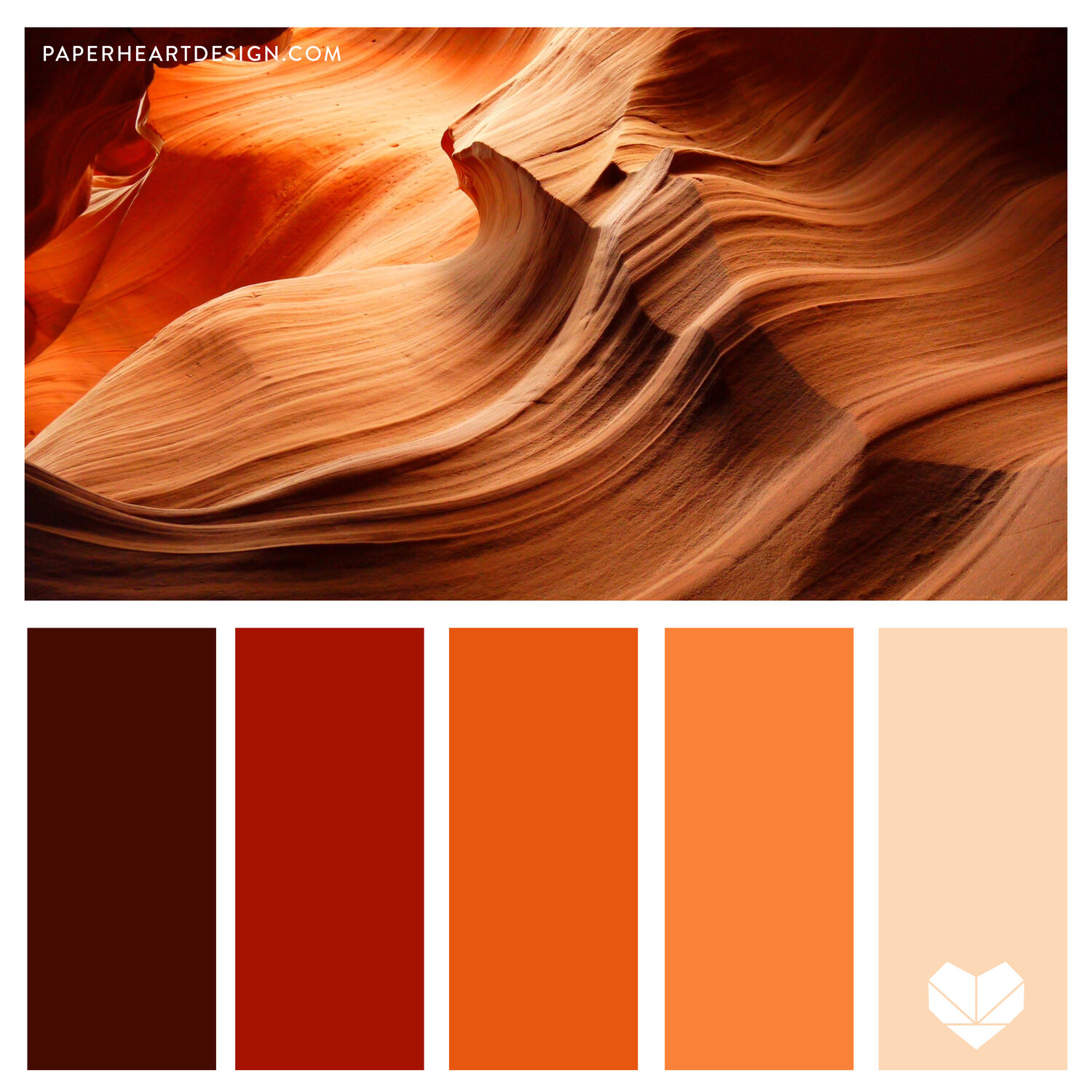
Credit: paperheartdesign.com
Frequently Asked Questions
What Is An Orange Color Palette?
An orange color palette is a selection of colors that complement or contrast with the color orange. It can consist of shades of orange, as well as other colors that complement or contrast with orange, such as blue, green, and purple.
How Can An Orange Color Palette Be Used In Design?
An orange color palette can be used in design to create a warm, energetic, and inviting atmosphere. It can be used in branding, web design, packaging, and more. It can also be paired with other colors to create a variety of moods and styles.
What Emotions Are Associated With The Color Orange?
The color orange is associated with a range of emotions, including warmth, energy, enthusiasm, creativity, and excitement. It can also be associated with caution, as in traffic signals and construction zones.
How Can I Incorporate An Orange Color Palette Into My Home Decor?
An orange color palette can be incorporated into home decor in a variety of ways. It can be used as an accent color in throw pillows, curtains, and artwork. It can also be used as a dominant color in furniture, such as a sofa or accent chair.
Additionally, orange can be used in combination with other colors to create a cohesive look.
Conclusion
The orange color palette is a versatile and dynamic choice for any design project. From bold and energetic to warm and inviting, the various shades of orange offer a wide range of emotions and meanings. By understanding the psychology behind this color and incorporating it effectively, designers can create impactful visuals that resonate with their audience.
So, next time you’re looking for a color scheme, consider the power of orange.