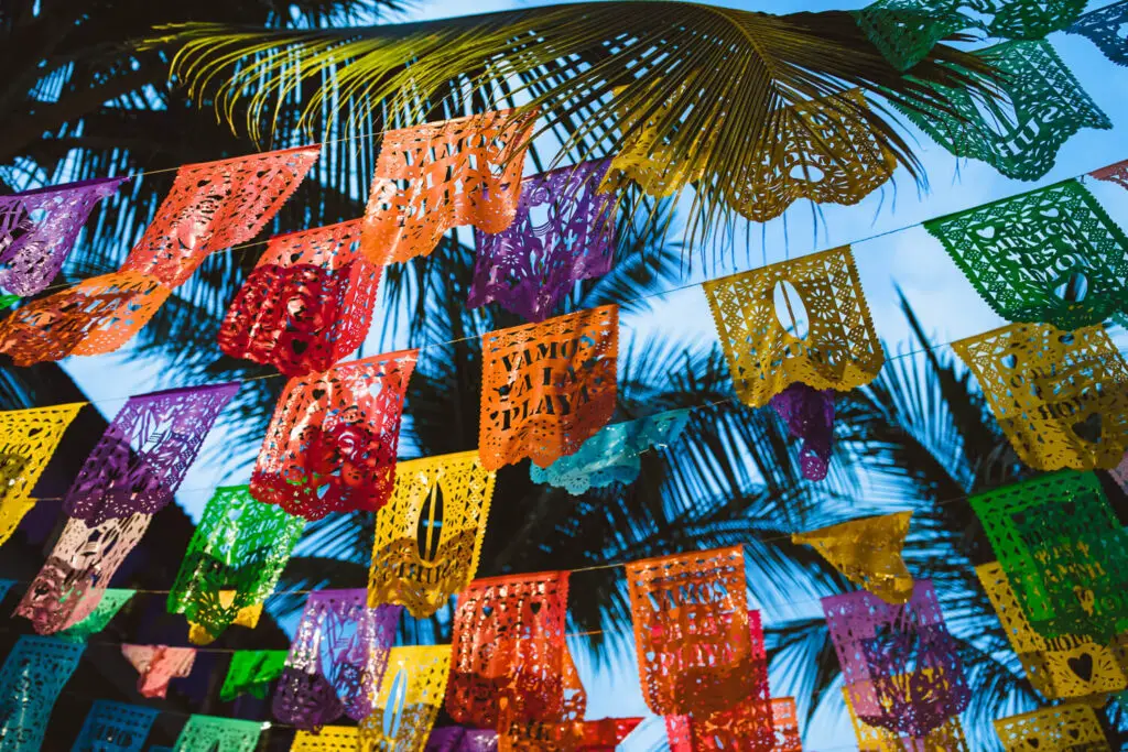
Yellow color palette consists of bright and vibrant shades that evoke feelings of warmth and happiness. It is often associated with positivity, energy, and creativity, making it a popular choice in various design projects.
From soft pastel yellows to bold mustard tones, the versatility of the yellow color palette allows for a wide range of expressions in art, fashion, and interior design. Whether used as a primary color or as an accent, yellow can instantly brighten up any space and create a cheerful atmosphere.
Let’s explore the different shades and combinations within the yellow color palette to inspire your next creative endeavor.
The Psychology Of Yellow In Design
Yellow color palette in design evokes feelings of happiness and optimism. It grabs attention and promotes clarity. Incorporating yellow can enhance creativity and evoke a sense of warmth and positivity in the overall design.
Yellow is a color that is often associated with happiness, optimism, and warmth. It is a color that can evoke many different emotions and cultural meanings, making it a popular choice for designers who want to create a certain mood or feeling. In this section, we will explore the psychology behind the use of yellow in design, including its emotional impact and cultural meanings.Emotional Impact
Yellow is a color that can have a powerful emotional impact on people. It is often associated with happiness, joy, and optimism, making it a popular choice for designs that are meant to evoke positive emotions. However, yellow can also be associated with caution or warning, as it is the color of many warning signs and caution tape.Cultural Meanings
The cultural meanings of yellow can vary depending on the country or region. In Western cultures, yellow is often associated with happiness, joy, and sunshine. In China, yellow is a symbol of royalty and power, while in Japan it is associated with courage and nobility. In Hinduism, yellow is the color of knowledge and learning, while in Egypt it was the color of mourning. When it comes to design, understanding the cultural meanings of yellow can be important in creating a design that is appropriate for the target audience. By using yellow in a way that is culturally sensitive and appropriate, designers can create designs that resonate with their audience and convey the desired message. In conclusion, yellow is a versatile color that can evoke a wide range of emotions and cultural meanings. By understanding the psychology behind the use of yellow in design, designers can create designs that are both aesthetically pleasing and emotionally impactful.Shades Of Yellow: From Lemon To Mustard
Explore the vibrant spectrum of yellow, from the zesty tones of lemon to the warm depths of mustard. This versatile color palette can bring a sunny touch to any space, creating a feeling of positivity and energy. Whether used in accents or as a primary shade, yellow adds a cheerful pop to any design.
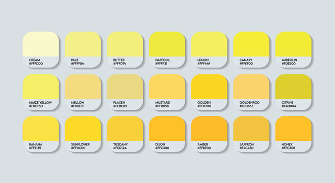
Introduction: Yellow is a bright and cheerful color that is associated with happiness, energy, and optimism. The shades of yellow range from soft and subtle to bold and vibrant. In this blog post, we will explore the different shades of yellow, from lemon to mustard, and how they can be used in a color palette. We will focus on warm yellows and cool yellows, highlighting their unique characteristics and how they can be incorporated into various design projects. H3: Warm Yellows Warm yellows are hues that have a hint of red or orange in them, creating a cozy and inviting feel. These shades are perfect for creating a welcoming atmosphere in a space. Some examples of warm yellows include: – Goldenrod: This shade of yellow has a rich, golden undertone that adds warmth and depth to any space. It pairs well with earthy tones like brown and green. – Butterscotch: This shade of yellow has a caramel-like hue that creates a cozy and inviting feel. It works well with warm neutrals like beige and taupe. – Sunflower: This shade of yellow is bright and bold, adding a pop of energy to any space. It pairs well with cool colors like blue and green. H3: Cool Yellows Cool yellows are hues that have a hint of green or blue in them, creating a refreshing and calming feel. These shades are perfect for creating a tranquil atmosphere in a space. Some examples of cool yellows include: – Lemon: This shade of yellow is bright and fresh, adding a cheerful touch to any space. It pairs well with crisp whites and cool grays. – Canary: This shade of yellow is bold and vibrant, adding a playful touch to any space. It works well with other bright colors like pink and purple. – Mustard: This shade of yellow has a deep, rich hue that adds a sophisticated touch to any space. It pairs well with warm neutrals like brown and beige. Conclusion: Incorporating shades of yellow into a color palette can add energy, warmth, and cheerfulness to any space. Whether you prefer warm yellows or cool yellows, there is a shade that can work for you. By understanding the unique characteristics of each shade, you can create a color palette that is both cohesive and visually appealing.Iconic Yellow Designs In History
Yellow is a vibrant and attention-grabbing color that has been used in various iconic designs throughout history. From art and architecture to branding and advertising, this sunny hue has left its mark on the world. Let’s explore some noteworthy examples of yellow designs that have stood the test of time.
Art And Architecture
In the realm of art and architecture, yellow has been utilized to evoke emotions, create focal points, and make a bold statement. One of the most iconic yellow artworks is Vincent van Gogh’s masterpiece, “The Starry Night.” The vibrant yellow swirling throughout the painting captures the essence of a starry night sky, enhancing the overall impact of the artwork.
Another notable example is the Taj Mahal, an architectural marvel renowned for its stunning beauty. The intricate details of this UNESCO World Heritage Site are accentuated by the golden yellow hue of the marble, radiating a sense of grandeur and elegance.
Branding And Advertising
Yellow is a color often employed in branding and advertising to grab attention and convey positive associations. One iconic example is the “Golden Arches” of McDonald’s. The vibrant yellow logo instantly catches the eye and has become synonymous with the fast-food chain, representing happiness, warmth, and familiarity.
Another famous use of yellow in branding is the yellow smiley face. This simple yet effective design has been widely adopted as a symbol of happiness and has been utilized by various companies and organizations to evoke positive emotions and create a memorable brand image.
Yellow has proven to be a powerful color in the world of design, leaving a lasting impact on art, architecture, branding, and advertising. Its ability to evoke emotions, capture attention, and convey positive associations makes it a popular choice for iconic designs throughout history.
Credit: stock.adobe.com
Color Combinations That Pop
With its vibrant and energetic nature, a yellow color palette is a surefire way to create eye-catching color combinations that pop. From pairing it with contrasting shades like purple or teal to using analogous hues like orange and green, the possibilities are endless for creating visually stunning designs.
Yellow And Blue
The combination of yellow and blue creates a striking contrast that instantly catches the eye. The vibrant energy of yellow harmonizes with the calming effect of blue, resulting in a visually appealing and balanced color palette. This combination is perfect for creating a lively and refreshing atmosphere in any space.
Yellow And Gray
When yellow is paired with gray, a sophisticated and modern color scheme emerges. The warmth of yellow adds a touch of vibrancy to the cool neutrality of gray, creating a balanced and elegant combination. This combination works well in both contemporary and traditional settings, adding a touch of sophistication to any space.
Yellow And Black
The combination of yellow and black is bold and dramatic, making a powerful statement. The high contrast between these two colors creates a visually striking effect that demands attention. Yellow adds a vibrant and energetic touch to the sleekness of black, resulting in a dynamic and eye-catching color combination. This pairing is perfect for creating a modern and edgy look.
Using Yellow In Digital Design
Yellow is a vibrant and energetic color that can bring warmth and positivity to digital designs. When used thoughtfully, yellow can capture attention and create a sense of optimism. In digital design, the strategic use of yellow can enhance user experience and convey a range of emotions, making it a versatile choice for websites and mobile apps.
Websites
Incorporating a yellow color palette into website design can evoke feelings of happiness and friendliness. When used as an accent color, yellow can draw the eye to specific elements such as call-to-action buttons, highlighting important information, and creating visual interest. It’s important to balance yellow with complementary colors to ensure readability and visual harmony.
Mobile Apps
When integrating yellow into mobile app interfaces, it’s essential to consider the psychological impact of the color on users. Utilizing yellow for notifications, alerts, or interactive elements can prompt a sense of urgency or action. However, it’s crucial to maintain a balance and avoid overwhelming users with excessive use of yellow.
Yellow In Print: Making An Impact
Yellow in print is a powerful choice that can instantly grab attention and evoke a range of emotions. Let’s explore how this vibrant color can make a lasting impact in various print materials.
Posters
Yellow posters are eye-catching and perfect for promoting events or products. The color symbolizes energy and positivity, making it ideal for grabbing attention.
Packaging
When used in packaging, yellow can convey happiness and warmth. It is often associated with sunshine and creativity, making products stand out on shelves.
Tips For Choosing The Right Yellow
Choosing the perfect yellow color palette can be a daunting task. Consider factors like undertones, intensity, and compatibility with other colors to create a harmonious and visually appealing look. Experiment with different shades and consult color charts to find the right yellow that suits your space and style.
Considering Lighting
Choose a warm yellow for rooms with ample natural light.
Opt for a brighter yellow in spaces with limited light.
Material Matters
Select a matte yellow for a subtle and soft look.
Choose a glossy yellow for a vibrant and modern feel.
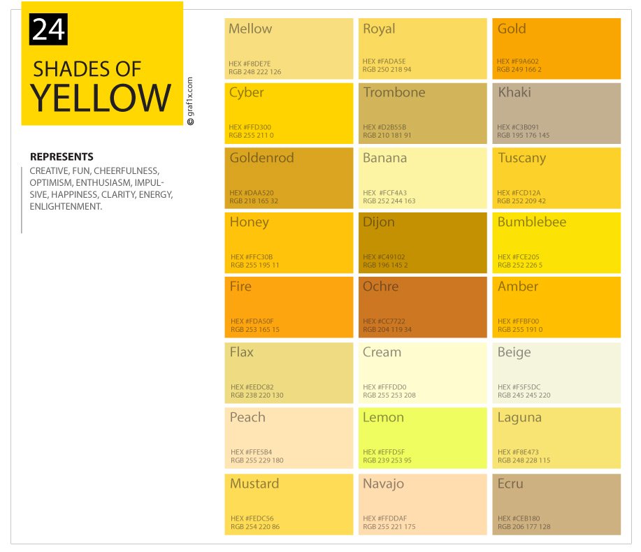
Credit: graf1x.com
Real-life Inspirations
This real-life inspiration is all about the yellow color palette. Yellow is a color that represents happiness, positivity, and optimism. It can be used in interior design to create a warm and welcoming atmosphere, as well as in fashion to make a bold statement.
Yellow is a versatile color that can be paired with many different hues.
Interior Design
Yellow color palette in interior design brightens spaces naturally.Fashion
Yellow hues bring vibrancy and energy to fashion collections. “`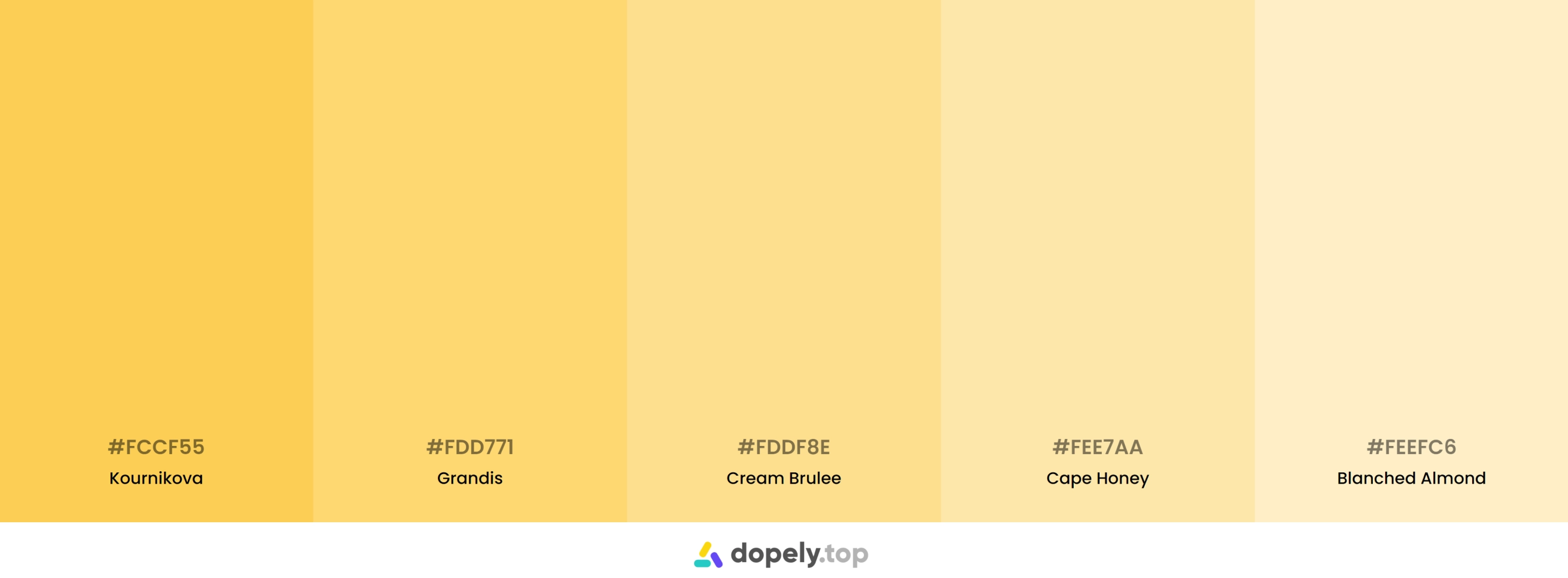
Credit: colors.dopely.top
Frequently Asked Questions
What Emotions Does Yellow Evoke In A Room?
Yellow can evoke feelings of happiness, warmth, and positivity in a room. It can also create an inviting and energetic atmosphere, making it an ideal color for spaces where people gather and socialize.
How Can I Incorporate Yellow Into My Home Decor?
You can incorporate yellow into your home decor by using it as an accent color through accessories like throw pillows, rugs, and artwork. You can also use yellow as a statement color on a feature wall or through furniture pieces like chairs or side tables.
What Are Some Complementary Colors For A Yellow Color Palette?
Complementary colors for a yellow color palette include shades of blue, green, and purple. These colors create a harmonious balance when paired with yellow, offering a visually appealing and balanced color scheme for your space.
Conclusion
Incorporating a yellow color palette can bring warmth and positivity to any space. Whether used in interior design or branding, the versatility of this vibrant hue is unmatched. By understanding the psychology and symbolism of yellow, you can effectively utilize it to evoke the desired emotions and create visually appealing compositions.